Exhibit 10: Custom Layer Style
My thoughts about this image...
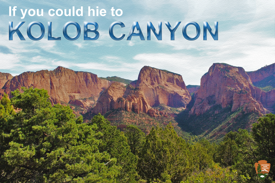
For this image I wanted to make a fun billboard for the National Park Service. I have often driven past Kolob Canyon and thought this line would make a witty invite for Kolob Canyon, based on the popular LDS Hymn, If You Could Hie to Kolob. I wanted to create my own style based on the clouds style, which I did by my own custom mix of stroke, satin, color overlay, bevel and emboss, and some gradient overlays. I also added an outer glow.
I thought this would be a quick read for those passing by on I-15 and give locals a chuckle, many of which are familiar with the phrase from the song. I adjusted the saturation and brightness of the sky so that the stylized cloud letters would pop more. I also adjusted the image of the canyon and added a nice texture filter to the image to make it a little more distinct looking.
Saturation: I desaturated the photo for emphasis on the stylized text.
Alignment: I wanted the text to stand against the rough edges of the canyon, so I positioned the text horizontally in stark contrast to the jagged canyon walls.
Contrast: I liked how the steep canyon walls contrast the sky and how the layers appear from green, to orange, and then blue.
Typography: This image relies heavily on the typography used to remind travelers to come enjoy the park.
Tools used included: Text effects, Drop Shadow, Styles, Hue/Saturation, Inner Shadow, Inner Glow, Color Overlay, Texture filter.
 RSS Feed
